Photos vs. Graphics: What Drives More Donor Action?


Donor Detectives Team
The Challenge:
When it comes to digital ads, the creative you choose can make or break your campaign. And if you’re in the nonprofit world, every click and donation counts. So, we ran a head-to-head test: graphics vs photos (example below). The goal? To help our clients optimize their digital campaigns and ensure their messages connect in the most effective way possible.
Spoiler alert: It’s not a one-size-fits-all answer, but the data gives us some pretty clear direction.

The Test: What We Wanted to Learn & How We Segmented the Audience
We conducted this test across 7 nonprofit clients and analyzed 42 ad sets, all implemented using Facebook’s Dynamic Creative option (formerly known as Flexible Ads). For this test, photos referred to real, camera-captured images, while graphics are custom-designed visuals that may include illustrations, text overlays, or other elements. This approach ensured both creative types were served to similar audiences, with comparable budgets, so we could fairly compare their performance. Here’s what we found out:

Graphics = Quantity
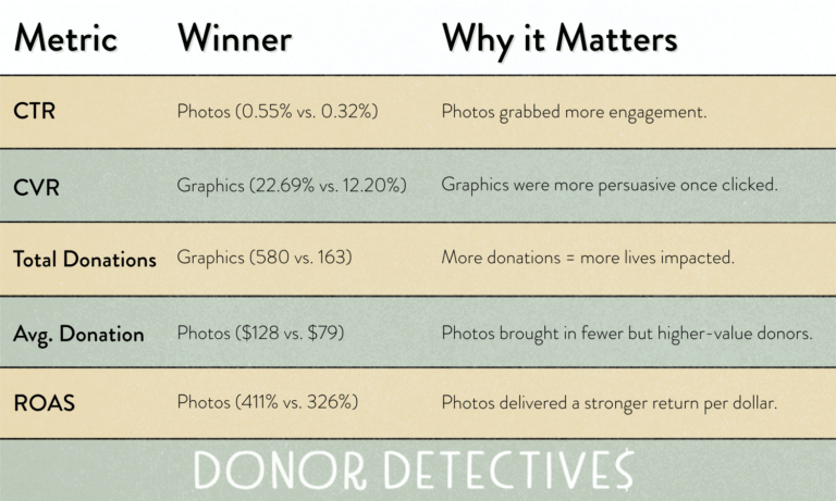
With the Conversion Rate significantly higher for graphic–based creatives, they were the clear winner when it came to driving MORE donations. People who clicked were far more likely to follow through and give. These creatives seem to do a better job of emotionally connecting with warm audiences; people who already know your mission and just need a little push.
Photos = Quality
With the Click Through Rate significantly higher for photo-based creatives, they were the clear winner when it came to driving MORE engagement.
Photos didn’t convert as many people, but when they did, they made it count. The average donation was 51% higher, and the return on ad spend proved it. These visuals worked well for catching the eye of new donors and inspiring bigger donations.
Creative matters and having the right kind of creative matters even more. While photos might win the first click, graphics tend to win the donation. The key is knowing when to use which, and why.